JUL/23 TO OCT/23
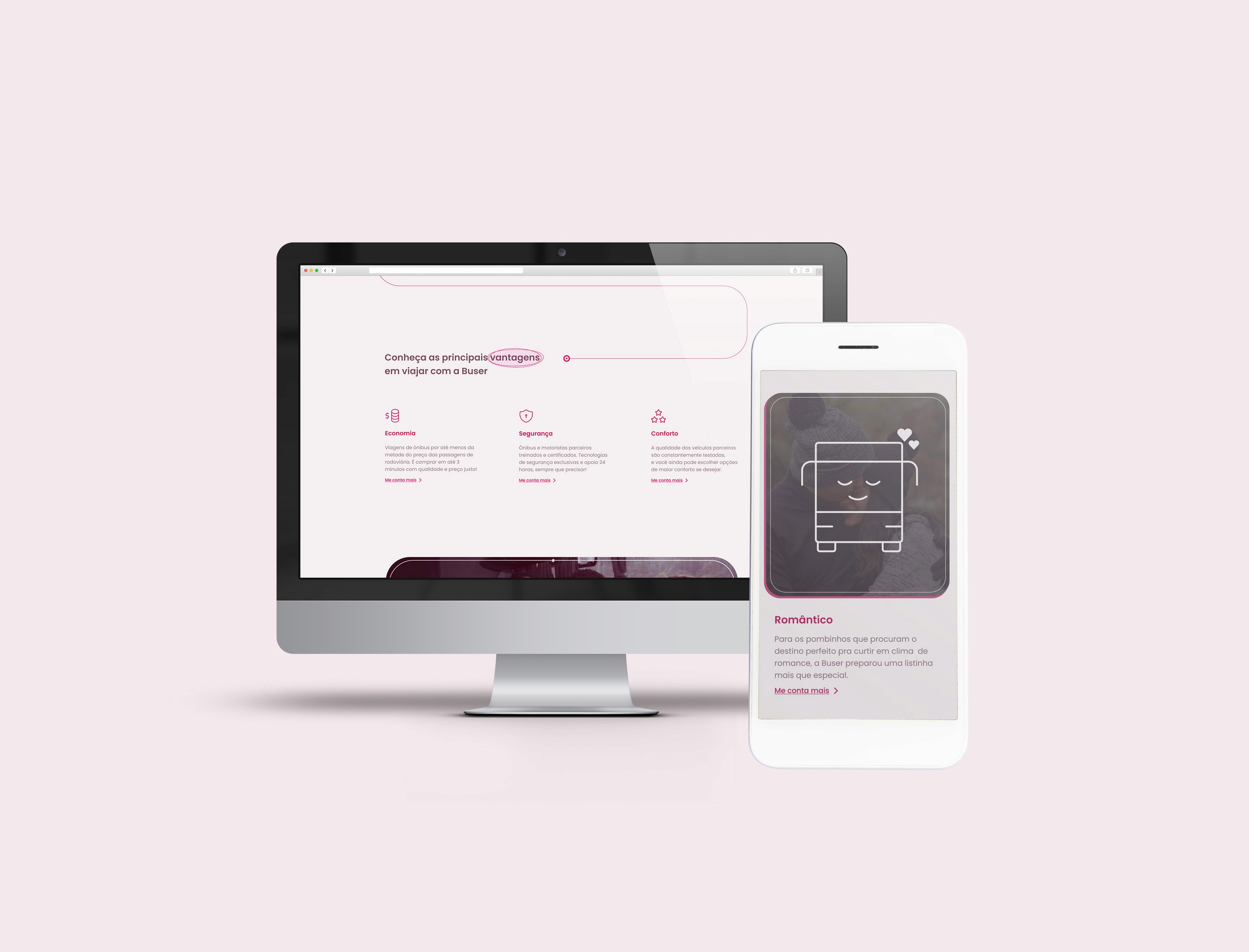
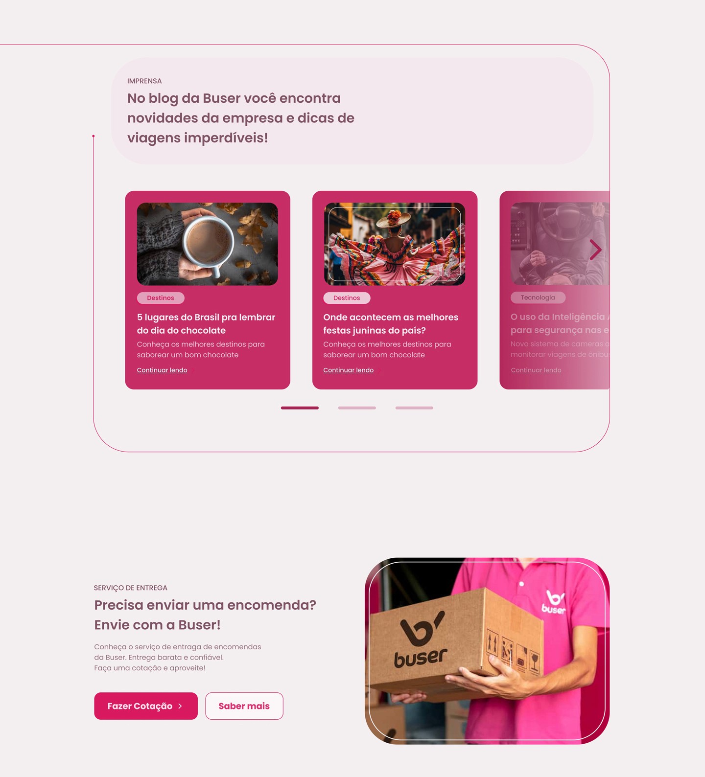
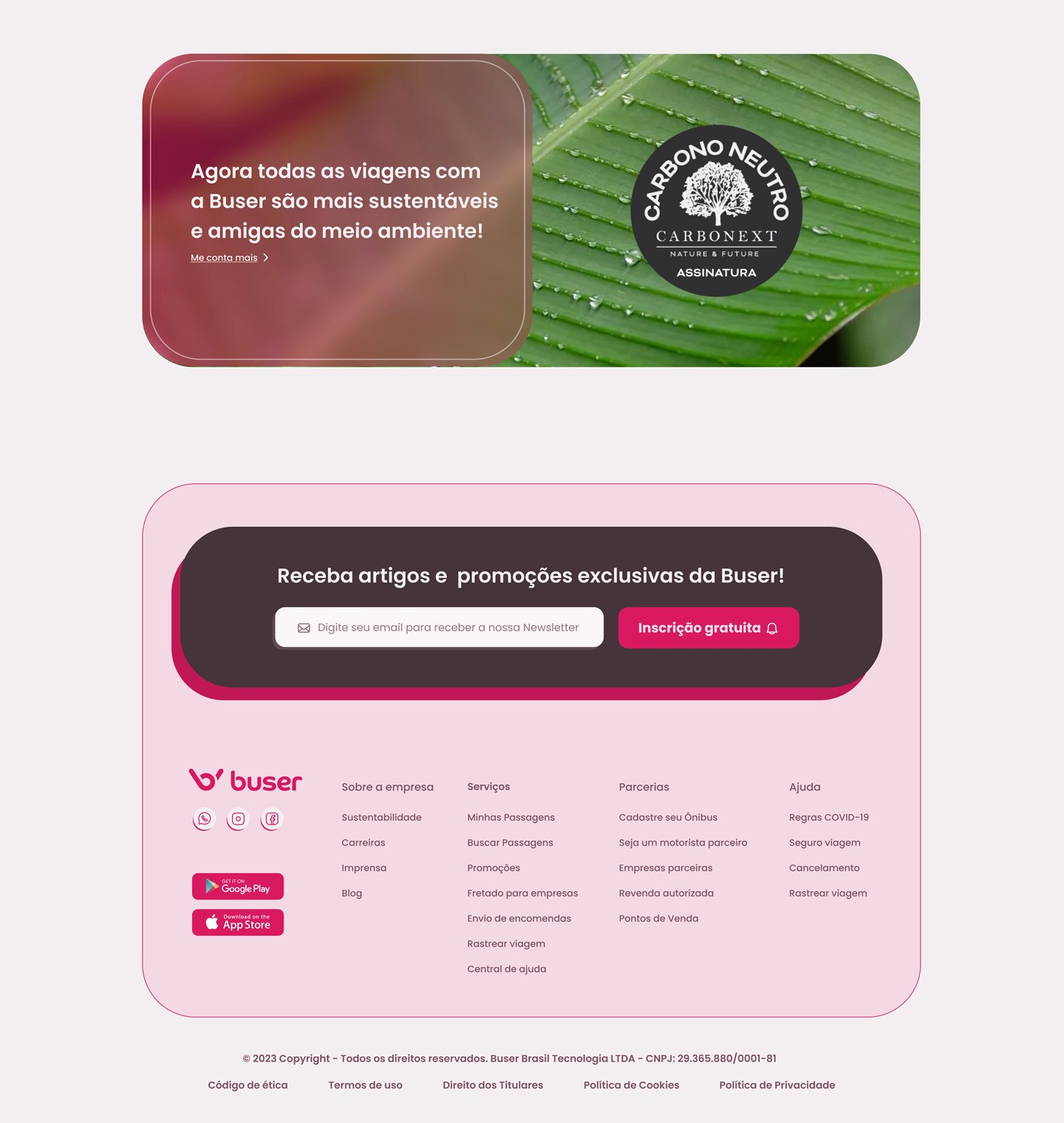
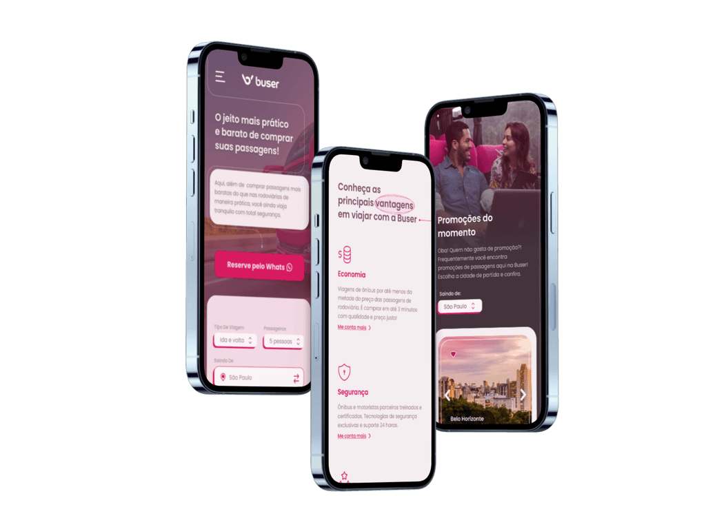
Website redesign
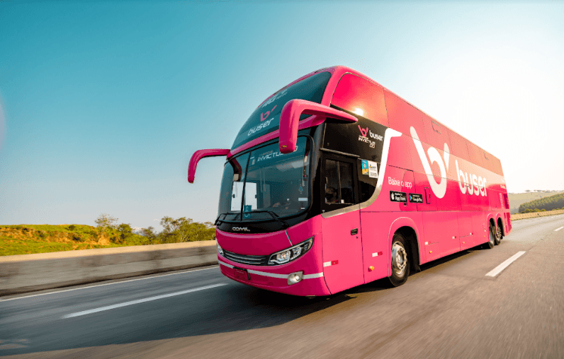
Buser is a Brazilian transport and bus ticket sales company. Offering more affordable tickets than usual, and implementing special security solutions, the company has been growing significantly since 2017 and attracts mainly women and young people.
My role: Redesign / Interface Design
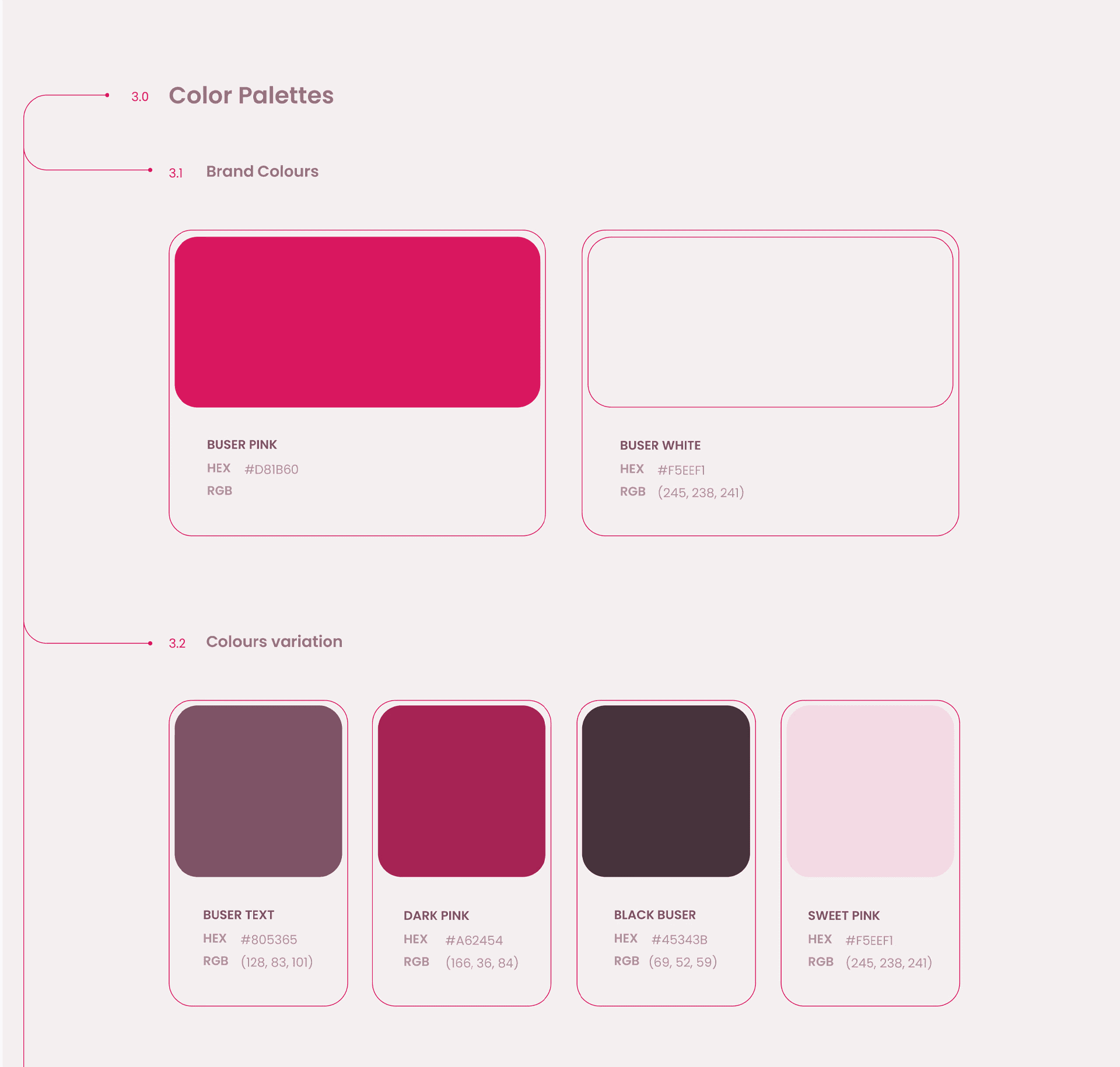
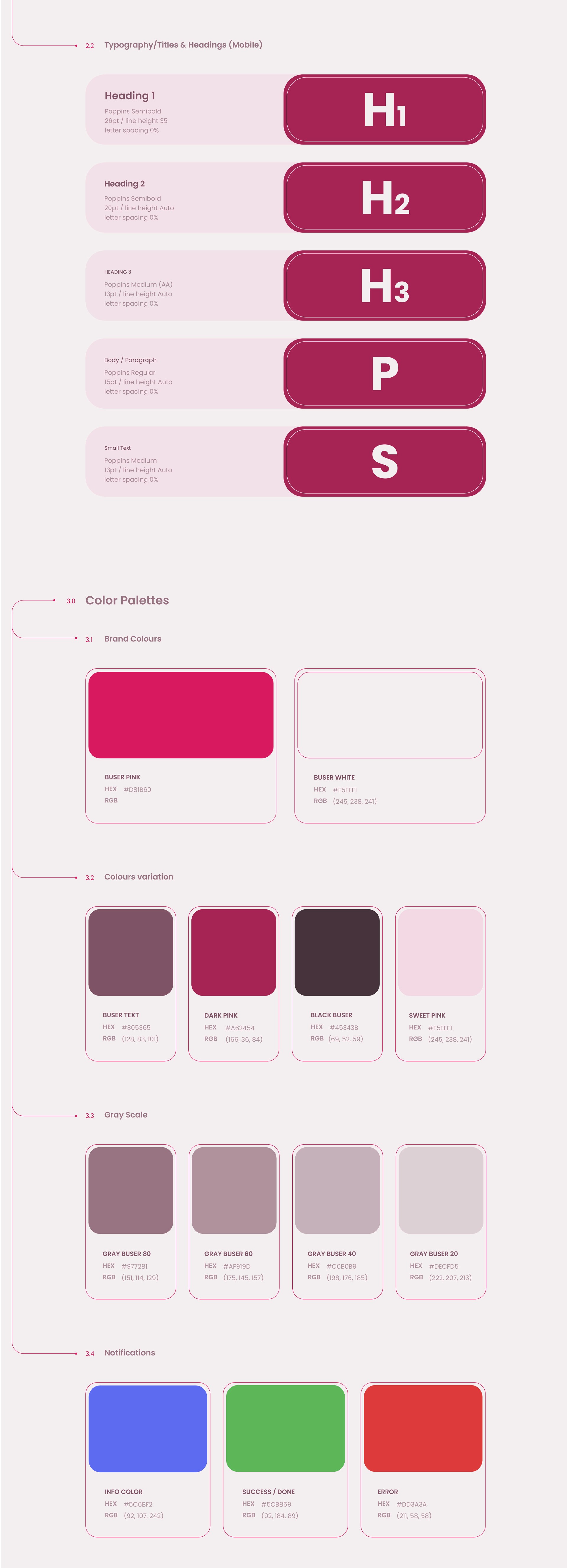
Color Palette
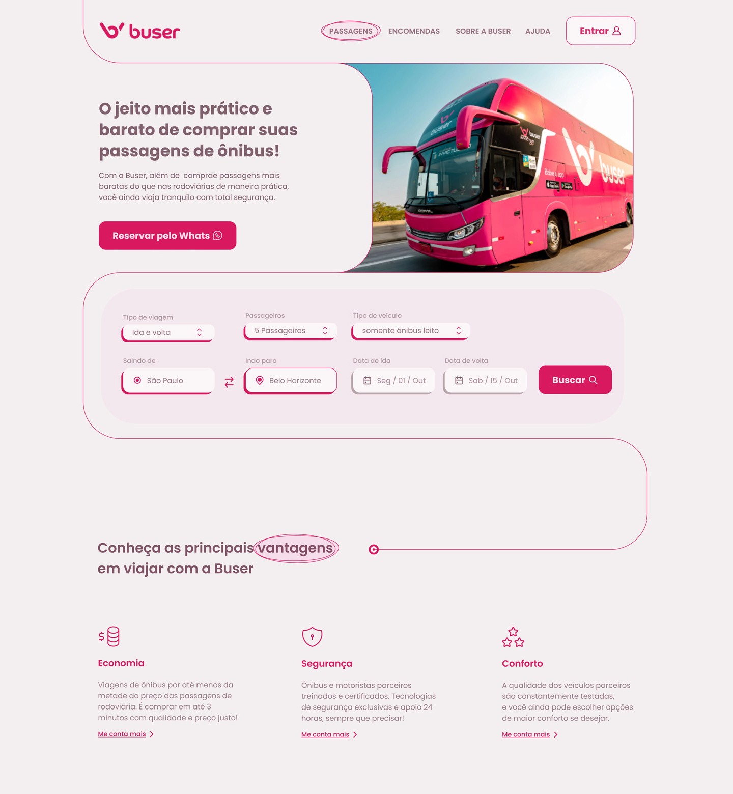
The brand has Pink as its main color, which is a very efficient strategy in terms of brand recognition. On their website, however, where their customers have to stay for some time until their travel destination is chosen and their tickets are booked, I decided to diversify the brand's palette with lighter contrasts to deliver a more visually comfortable experience.
Elements
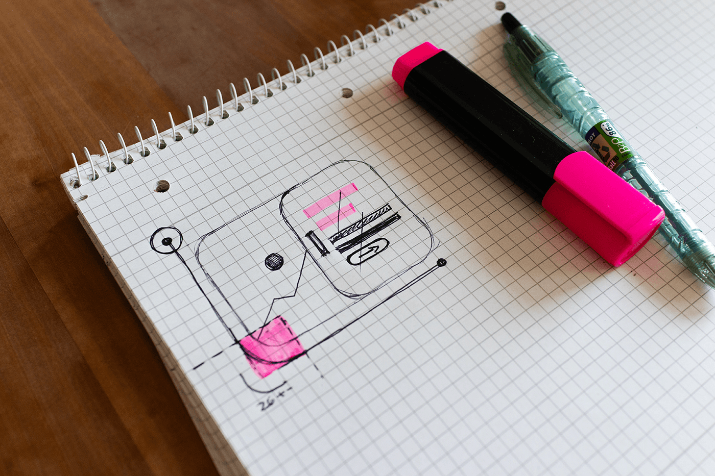
In order to create an even more immediate understanding of the company's segment, I created some simple graphics that simulate paths and the basic concept of a route: Getting from point A to point B.
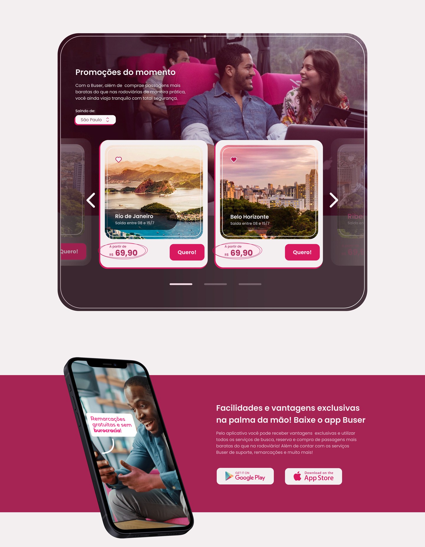
And to receive some of the content, I used rectangles with rounded edges, which sometimes made mention of what I consider to be the best part of a bus journey: looking out of the window.
Illustration
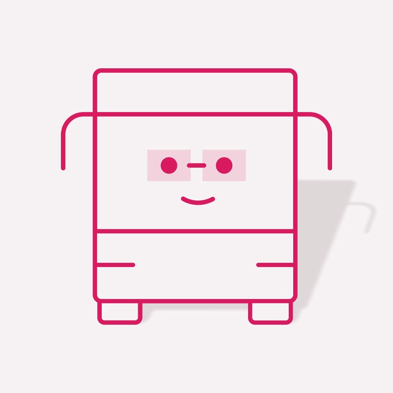
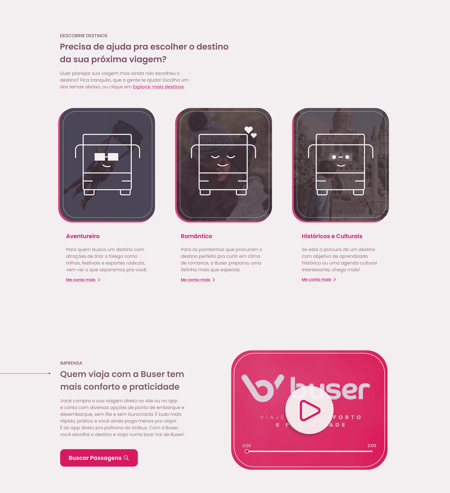
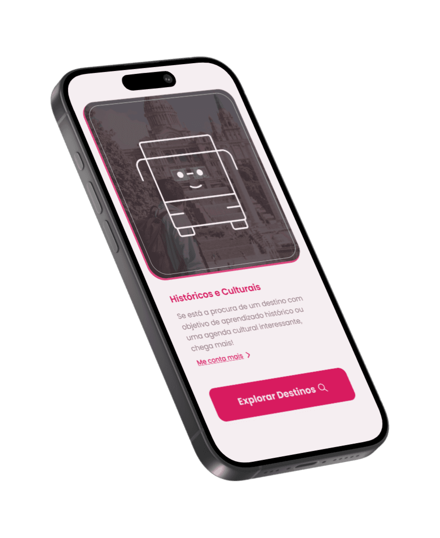
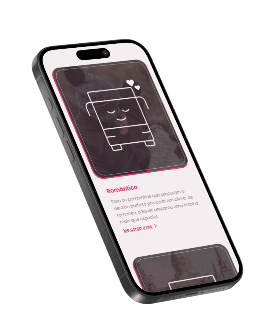
What if the user still doesn't know where to go? To offer alternatives for users who visit the site looking for inspiration, I decided to create these 3 bus mascots to help categorize tourist destinations. This way, users could explore the site in search of their next destination, according to their personality or intentions, choosing between Romantic, Adventurous or Educational destinations.
WEBSITE REDESIGN: FINAL RESULT
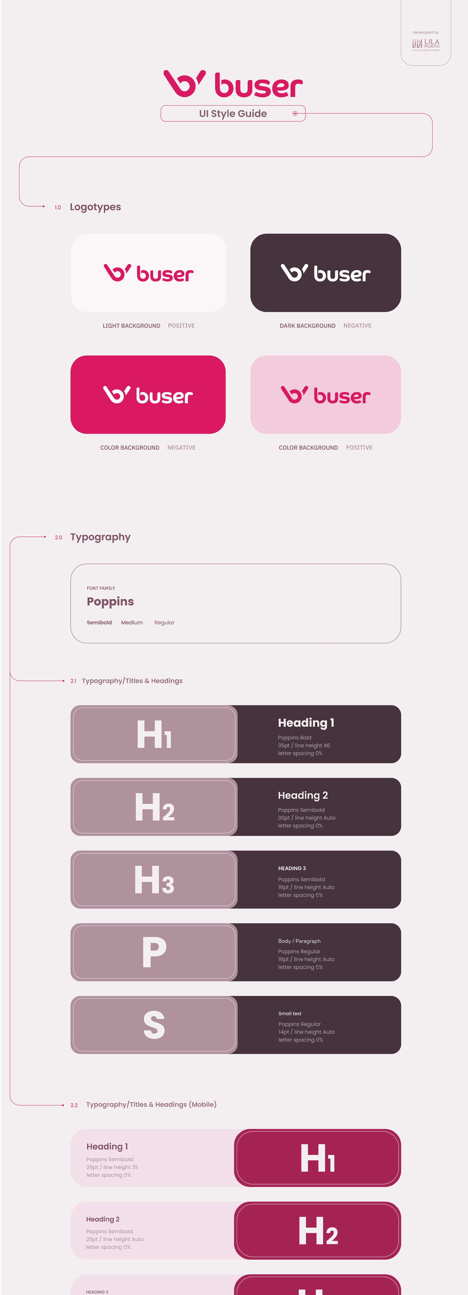
Style Guide and Screens

MORE PROJECTS

